


Who Owns the Market?

This past month, I’ve been playing around with the Federal Reserve’s Flow of Funds data. I thought it would be interesting to discuss some descriptive issues in financial ownership and portfolio allocation (and to showcase some graphs I’ve made). The goal of this post is to explore such questions as: Who owns the stock market? Have households increased their stock ownership over time? How does stock ownership differ from bond ownership?1
Who Owns the Stock Market?
For starters, I break down the ownership of the US domestic stock market:
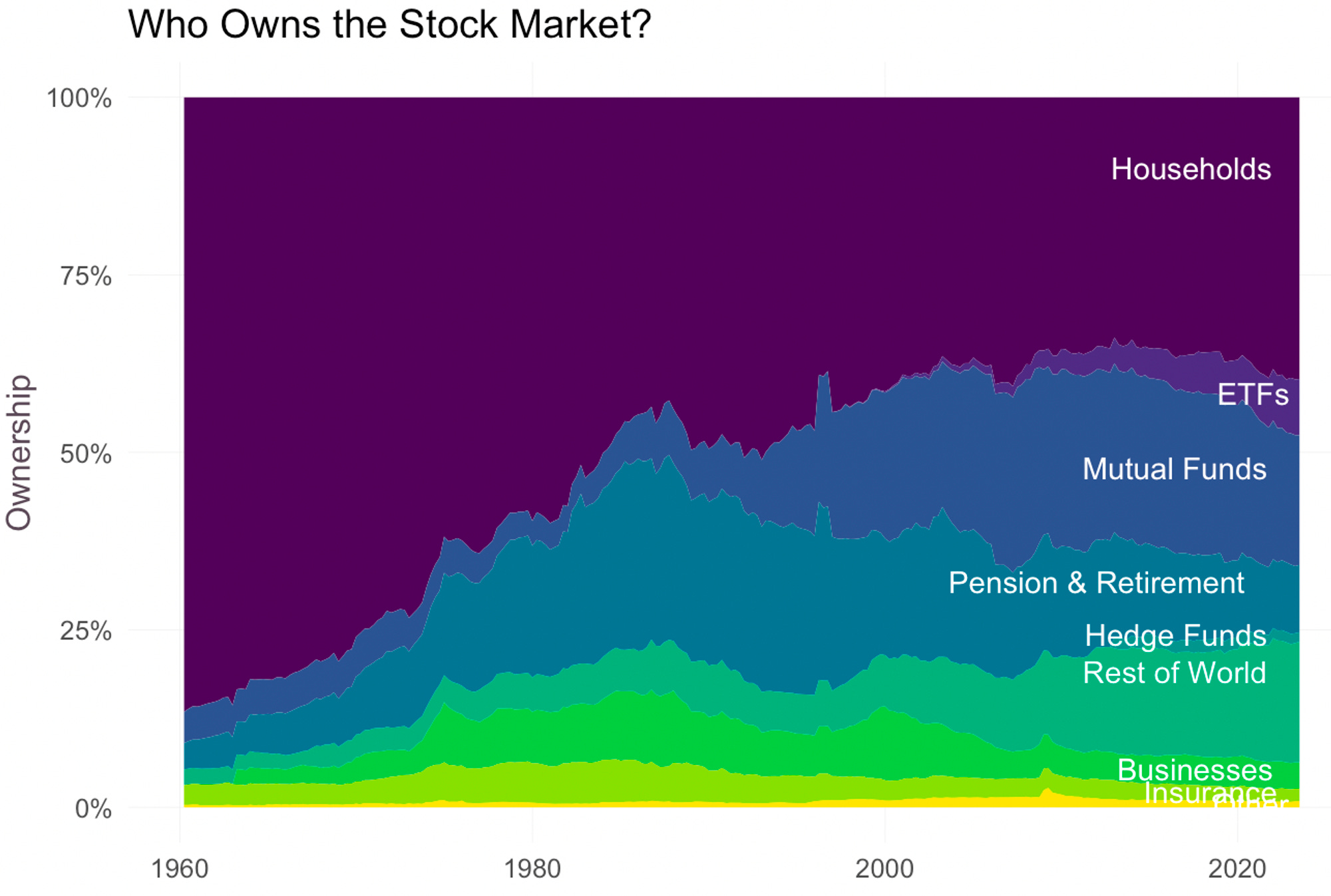
A couple observations:
Hedge funds are tiny. For all the talk about hedge funds and their role in their economy, domestic hedge funds own less than 2% of stocks.
ETFs vs. Mutual Funds: ETFs are rapidly stealing market share from mutual funds. ETFs tend to have lower fees, better tax advantages, more liquidity, and are generally just strictly better than mutual funds, so it’s not so surprising.2
Households matter less: US households used to control 80% of the market, now they control about half that. The big increases are in the “Rest of the world” and mutual fund sector.
Does this mean a typical household has less stockholdings than it did in the past?
No, not exactly. First, the Federal Reserve’s “household” sector is a broad designation that also includes things like nonprofits and some private equity, so it’s not exactly equivalent to “retail investors” or whatever else you might think when you hear the word “household”.3 Second, households own a little more than half of mutual funds, so at least part of the decline in household stock ownership is simply due to households choosing to gain exposure to financial markets through intermediaries (i.e. mutual funds) rather than through direct holdings. Third, this charts total ownership, not the ownership of a typical household. If one sector gets wealthier, but has no change in the fraction of its wealth it allocates to stocks, it will end up owning more of the stock market. Additionally, the behavior of a few ultra-wealthy households may drive much of the results.4
To dig deeper into these distinctions, let’s first investigate the hypothesis that households only appear to own less of the market because they choose to gain exposure through ETFs/Mutual funds rather than through direct holdings.5 As before, I chart the direct ownership of the stock market by households, but now add a line that adjusts this fraction to include household stock ownership through mutual funds. For example, suppose households own 20% of the stock market directly, but own 50% of mutual funds, which themselves hold 10% of the stock market. Then the ‘direct’ ownership is 20%, and the “adjusted” ownership is 20% + 50%*10% = 25%.6

Comparing the two lines makes it clear that a great deal of the shift, at least post 1980, is indeed due to reallocation to these intermediaries. But this clearly does not explain the long time series results (e.g. 2020 vs. 1960).
The second candidate hypothesis is that these dynamics are driven by changing portfolio weights. By looking at the fraction of its financial assets each sector allocates to equities, we can understand the extent to which changes in ownership are driven by changes in asset allocation as opposed to say, changes in wealth. Below, I’ve plotted the time series of the fraction of financial assets invested in stocks for various sectors in the Flow of Funds data.7
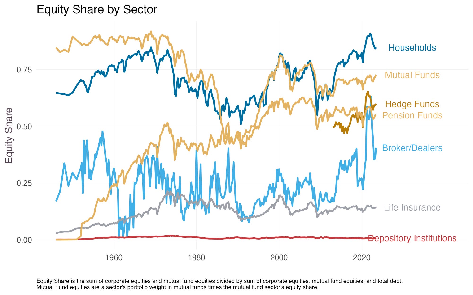
Looking at the equity allocation by sector makes it clear that the decreasing ownership of households is not really explained by big changes in the fraction of financial assets allocated to stocks; if anything, this fraction has increased since the 1960s. So the change in ownership is more likely to be driven by size/composition effects, i.e. the large increase in foreign investor participation, than by changing asset allocation.
Finally, we can also speak to the difference in the “typical” household vs. the aggregate household sector by bringing in additional survey data. Economists (rightfully) tend to distrust a lot of survey data, but the Federal Reserve’s Survey of Consumer Finances is the gold standard. This triannual survey collects (and verifies) detailed balance sheets from the participants it interviews. Since the participants are individuals drawn at random from the US population, this data is useful for capturing the cross-section of financial behavior among households. Consider what this survey shows about the fraction of households that own various financial assets:

Surprisingly (to me, at least) the fraction of US households that directly owned stocks was lower in the 2010s than around the early 2000s (I wonder if this was a consequence of the dot-com boom). But today, stock ownership — whether directly held or held unconditionally — is at an all time high.
Taking stock of what we have learned about US equity ownership over time:
The typical US household has increased its exposure to equities, whether measured as the share of the household sectors’ wealth in equities, or as the fraction of US households with stock holdings.
The household sector accounts for a significantly smaller share of stock market ownership than it used to.
In other words, even though households allocate more to equities than they used to, they end up owning less of the overall market due to (a) increasing indirect ownership (through intermediaries like mutual funds), and (b) the rise of other investors — e.g. foreign ones — that have rapidly entered the market.
Who Owns Debt Markets?
Now let’s look at bond markets. On the left, I show ownership of corporate/foreign bonds; on the right I show ownership of US Government bonds (i.e. treasuries):

Some observations:
Households (still) matter less: Households play a negligible role in these markets, but they used to hold a somewhat larger share. Since mutual funds and ETFs also play a fairly small role in these markets, it is not as if households are simply reallocating to bonds through active intermediaries. However, households are ultimately beneficiaries of pension, retirement, and life insurance plans, which are large players in these markets. So there is some exposure to fixed income.
Who are the arbitrageurs in the Bond Market? An underlying assumption of a lot of finance theory is that there exist sophisticated investors to correct mispricings, thereby ensuring markets are efficient. We tend to think of these arbitrageurs as price-elastic investors with comparatively fewer regulatory burdens — perhaps hedge funds, (active) mutual funds, or sophisticated investors from the household sector. They can also be market makers, like broker dealers, that can quickly absorb supply. But in the bond market, none of these players is particularly large (especially when you consider that a lot of bond mutual funds and ETFs are passive, and thus perfectly price-inelastic!). So who is `correcting' prices in the bond market??
Differences between Corporate and Treasury Markets: I had initially expected that the ownership shares of corporate bonds would be somewhat similar to the ownership shares of the US treasury market — they’re both fixed income after all. While there are some common themes, the main differences are that insurance companies are basically nonexistent in the Treasury market but are the largest player in the corporate/foreign bond market. Perhaps one reason for this pattern is that insurance companies effectively pay out the risk free rate (or close to it) to policyholders, so they need to earn at least that much on the asset side. If you hold corporate bonds, but pay out the risk-free rate, you pocket the ‘credit spread’ as your profit.
Banks? What about the banks — places like JP Morgan Chase, Wells Fargo, Bank of America, etc? The (striking) absence of depository institutions from the above plots suggests they don’t account for a large ownership of the stock, corporate bond, or US treasury markets! So what do they hold? As it turns out most of their assets are held in loans (think mortgages, credit card debt, etc) and agency-backed securities, like GSEs. Together these account for something like 80% of their assets. So banks don’t seem as important players in the market for more typical financial securities.
Conclusion
This post was primarily descriptive, but as usual I will end with some big-picture thoughts.
How Does this Relate to Finance Theory? A well known stylized result known as the “two fund theorem” suggests that investors will all hold the same portfolio of risky assets, but differ in how much of this portfolio they hold. Clearly, this is not what we see in the data. Of course this model relies on highly stylized assumptions — in the real world, there are regulatory reasons why insurance companies hold corporate debt, why banks hold loans, etc — but even so, finance theory struggles to capture the vast heterogeneity in portfolios observed in the data.
Portfolio Weights vs. Ownership: When we talk about trends in equity allocation, should we focus on ownership (how much of the security’s total market capitalization is owned by a certain sector) or portfolio weights (what fraction of a sector’s assets they allocate to stocks)? While ceteris paribus, increases in allocation will lead to increases in ownership, as we saw in the data they can clearly diverge: the household sector allocates more of its wealth to equities over time (portfolio weights) but owns less of the equity market (ownership). Which of these two measures is more important? If we care about the household sector’s effect on asset prices, ownership is the more important object to study, since it captures a sector’s relative size in the market. If we care about the household sector’s welfare, performance, or understanding its risk/return preferences, then the changing portfolio weights is the relevant object to study, since it captures their demand.
Size Isn’t Everything: In some of the previous points, I equated the size of a sector with its ability to matter in affecting prices. While the intuition here is straightforward — the more capital that a sector has, the more it can move prices by allocating those flows — size isn’t everything. A sector can be very small, but if its demand is very elastic (responsive) to prices, it can have an important role for prices. For example, there is some interesting research showing that Robinhood traders made a large impact in the market despite having a small fraction of total wealth. Something similar may be happening in the bond market, where even very small institutions (hedge funds, broker dealers, etc) trade actively at high frequencies to correct mispricings, but do not account for a large share of holdings at any given time.
I’m grateful to Philip Groenwegen and Federico Mainardi for comments.
The main tax advantage of ETFs over mutual funds is that when other investors in the fund sell their shares at a profit, this creates a taxable event for mutual fund investors (even if you yourself didn’t sell) but not for ETF investors.
Private equity firms hold almost no stocks, and both the private equity and the nonprofit sector are tiny relative to households, so this shouldn’t matter too much. For example, the nonprofit sector is roughly 7% the size of the household sector.
For more evidence on the extent to which the household sector’s allocations are driven by ultra-high net worth individuals, see this paper.
Note that the whole notion of ‘indirect household exposure’ to stocks is a little strange to think about: all dividends — whether through governments, pension funds, etc — must eventually flow through to the household sector, since all intermediaries are owned by households. So the idea to adjust for only mutual funds is to capture the most direct intermediary that households control allocation toward.
These calculations embed some assumptions, e.g. that the household sector holds a broadly diversified portfolio of mutual funds; and that that the share of mutual funds owned by households is similar to the share of ETFs held by households.
The denominator here is not total worth, but rather total financial worth. So it excludes things like housing and cash